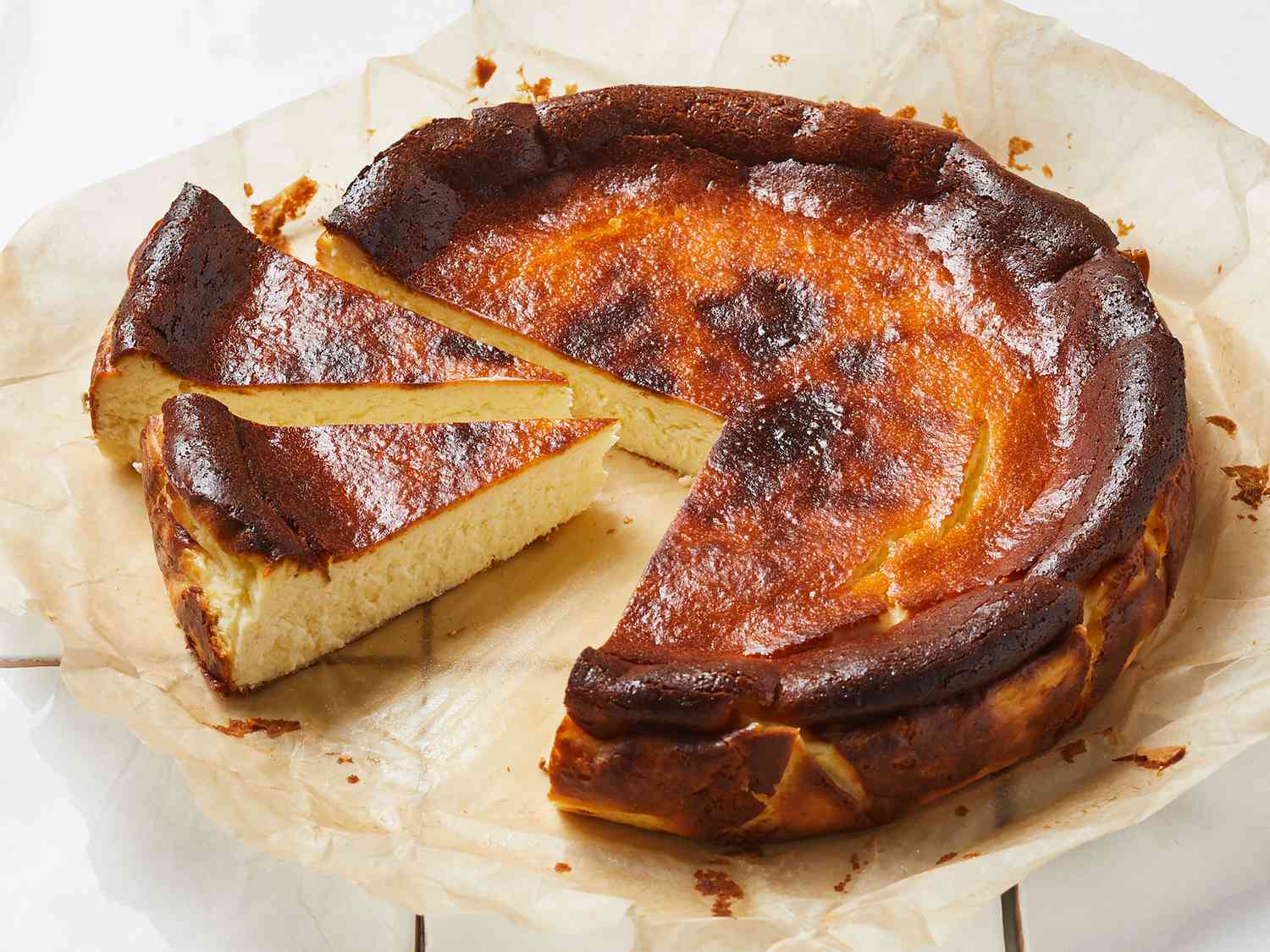
A Basque specialty that has pastry cream encased in a light shortdough pastry.
1 ⅛ cups milk
⅓ cup white sugar
⅓ cup white sugar
2 tablespoons all-purpose flour
2 eggs
1 teaspoon vanilla extract
1 ⅛ cups all-purpose flour
½ teaspoon baking powder
1 ⅛ cups white sugar
3 eggs
Americastestkitchen This website is clean and polished, the layout is very clear and users can find their dishes easily. It is user-friendly and easy to navigate around. The font and color choices match the theme of the website and feel professional.
Blue apron This website have good use of negative space so it feels very comfortable scrolling through the recipes. The hierarchy of text makes it easy to see the main compoenents of the recipe, such as the title,ingredients and time. The photos make the dishes look appealing.
Hellofresh This website is very organised and it groups recipes based on tags like region or type of dish. The typography is very consistent and easy to follow. Even the photos have similar layout and they are all taken in the same angle shot and have round plate.
Wholefoods I like the way Wholefood incorporate food images into their website. The photos are integrated smoothly with body of text. There are also small details like drop shadow that make the photo stands out.
Mcdonalds I think the side menu bar is easy to navigate and showcases all the burger options clearly. Even though the color choice is limited, it matches well with the branding through using yellow buttons. They also showcase each ingredients on seperate photos.
Benjerry I like the small animation on the header because it makes the website more interactive. Also the design of making the button grey while hovering over is very user-friendly.The style of photo is also consistent.